When, Where, and How to Use the “H-Town” Houston Texans PNG Transparent Logo
The “H-Town” logo (part of the rebrand launched in April 2024) comes with very specific usage rules. Unlike the corporate “Bull” logo, this design is rooted in the city’s urban culture. ![]()
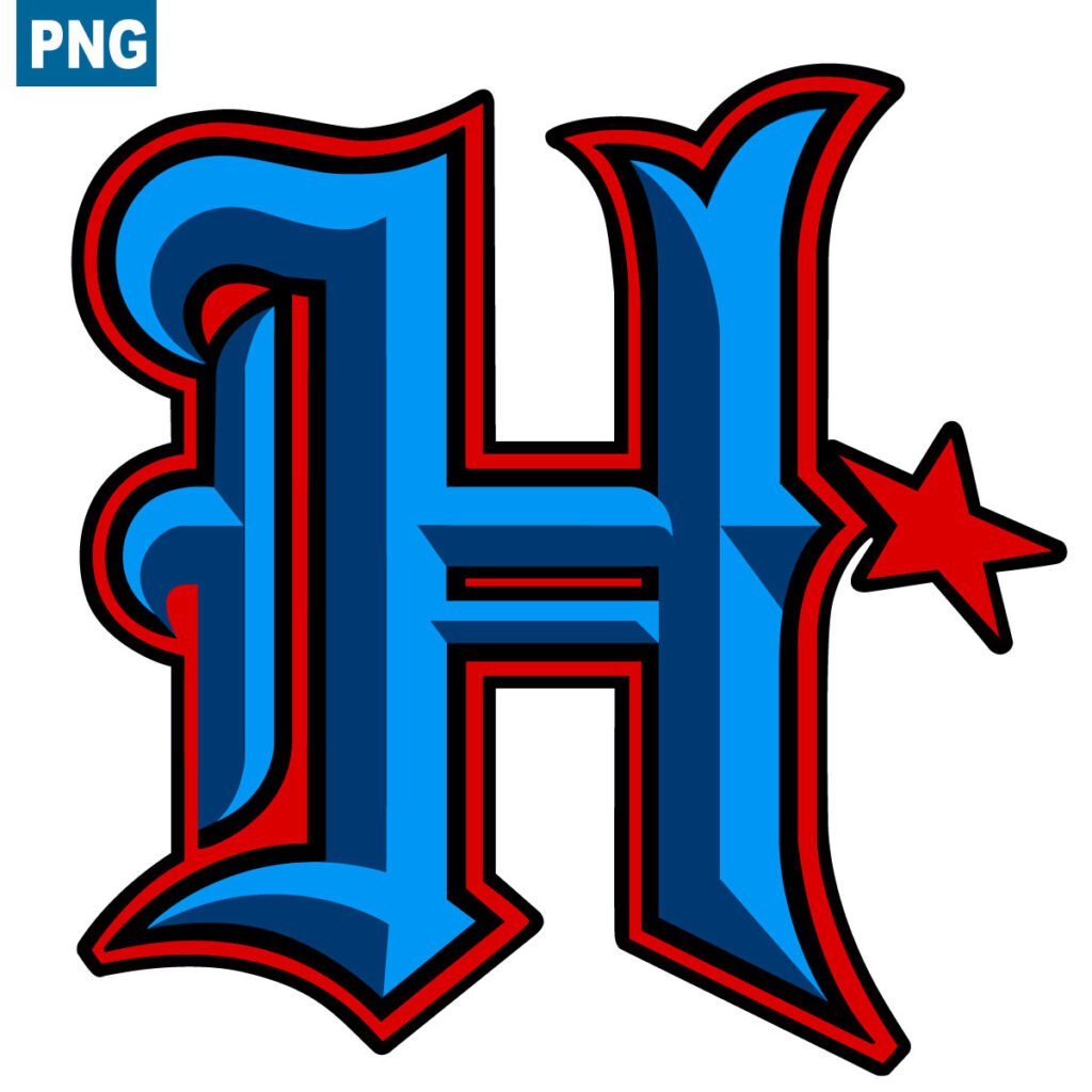
Information: H-Town Houston Texans PNG transparent logo.
Type: logo, icon, symbol, emblem in PNG.
Format: PNG, 1200px X 1200px
![]()
Here is your guide on When, Where, and How to correctly use this transparent PNG file:
1. What is this logo?
This is not the primary franchise logo. The “H-Town” logo generally refers to the stylized “H” (inspired by Old English/Blackletter typography) or the “H-TOWN” wordmark found on the alternate uniforms.
The Vibe: It represents Houston’s street culture, “Candy Paint” car culture, Hip-Hop roots, and city pride.
The Key Color: It features “H-Town Blue” (a light, Columbia blue), a clear historical nod to the city’s football past (the Houston Oilers), even if not officially named as such for legal reasons.
2. WHEN to use it (Context)
You should not use this logo for generic team news. It is reserved for specific moments:
Alternate Uniform Games: Only use this when the team is wearing the H-Town alternate kit (Deep Steel Blue helmet with the light blue “H”, and red/blue accents).
Lifestyle & Culture Content: When the focus of your design is fashion, urban culture, player arrival fits (“the drip”), or collaborations with local Houston artists.
Prime Time Games: These alternate uniforms are often showcased during Sunday Night or Thursday Night Football.
3. WHERE to use it (Platforms & Backgrounds)
Dark Mode (Crucial): Because the logo relies heavily on “H-Town Blue” (light blue) and vivid red, it requires a dark background to pop.
Don’t use: On white backgrounds (the light blue will vanish and lose impact).
Do use: On Deep Steel Blue (Navy), Black, or dark concrete/asphalt textures.
Streetwear Merchandise: If you are creating mockups, this logo belongs on hoodies, oversized tees, and snapbacks—not on corporate polo shirts.
Social Media: Use this for content targeting the younger demographic or discussing the “vibe” of the city, rather than statistical analysis.
4. HOW to use it (Design Tips)
When manipulating the transparent PNG in Photoshop or Canva:
Mandatory Color Palette:
Background: Use the official Deep Steel Blue (#03202F) or Pitch Black (#000000).
Glow Effects: To make it stand out, add a soft outer glow in H-Town Blue (approx. #99CCFF or #418FDE).
Typography:
Avoid classic serif fonts (like Times New Roman).
Pair this logo with Gothic / Old English / Blackletter fonts, or bold, italicized sans-serifs to convey speed and grit.
Placement:
The “H” logo works best centered or used as a large, low-opacity watermark in the background of a player graphic.
5. The Golden Rule
Never replace the primary “Bull” logo with the “H-Town” logo for official standings or league news. The “H-Town” mark is a lifestyle and culture brand, not the primary institutional identity of the NFL franchise.