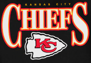
The Kansas City Chiefs have a storied history, and their logo has undergone a significant transformation over time.
The Evolution of the Kansas City Chiefs Logo
Before moving to Kansas City, the team was originally known as the Dallas Texans, a franchise founded in 1960 by Lamar Hunt. When the team relocated to Kansas City in 1963, they adopted the new name Chiefs, honoring the city’s mayor, Harold Roe Bartle, who was nicknamed “Chief.”

The team’s first official logo, introduced in 1963, featured a Native American figure running with a football, placed over a map of the United States. This design reflected the Native American theme connected to the team’s identity. For nearly a decade, this logo symbolized the franchise’s new beginnings in Kansas City.

In 1972 the team sought a cleaner and more modern look. The new design was inspired by a sketch drawn by Lamar Hunt on a restaurant napkin, depicting the letters “KC” inside an arrowhead. The sketch was refined by a design team, resulting in the iconic white arrowhead logo, outlined in red or black, that fans recognize today.
However, despite this official branding, the arrowhead logo with the “KC” monogram made its first appearance in 1963 on the team’s helmets, right from the beginning of their Kansas City era. The arrowhead design, sketched by Lamar Hunt on a restaurant napkin and later refined by designers, was chosen for its clean and recognizable look on the field. The Chiefs wore red helmets featuring the white arrowhead outlined in black, creating one of the most memorable helmet designs in the NFL.

Chiefs logo 1972 – Pres
This evolution wasn’t just about aesthetics—it marked the growth of a franchise that would become a staple in the NFL and a symbol of pride for Kansas City fans.
Kansas City Chiefs Wordmark Logo: A Bold Symbol of Tradition and Unity in the NFL
The Kansas City Chiefs’ wordmark logo embodies a strong and traditional identity that complements the team’s iconic red arrowhead logo. The primary version of the wordmark typically features the text “Kansas City Chiefs” in a bold, sans-serif font. The dominant colors are red (Red PMS 186 C) and gold (Gold PMS 1235 C), consistent with the team’s overall visual identity.


Key Characteristics of the Wordmark:
- Font: The typography is clean, bold, and simple, reflecting the team’s values of strength, tradition, and unity.
- Colors: Red represents passion, energy, and competitive spirit, while gold conveys warmth, success, and a link to the team’s deep-rooted history.
- Layout: The wordmark is often displayed in two main formats:
- A compact version with “Chiefs” highlighted, commonly seen on uniforms, merchandise, and broadcasts.
- An extended version with “Kansas City” positioned above or alongside “Chiefs,” typically used in official signage.
Purpose of the Wordmark in the Team’s Visual Identity
The Chiefs’ wordmark reinforces the team’s brand as one of the most recognizable in the NFL, maintaining a strong connection with its passionate fanbase. It complements the arrowhead logo without competing for attention and is versatile enough for use across various media and promotional materials.
Wordmark Usage:
- On uniforms, the wordmark can often be found on accessories like hats and jackets.
- During TV broadcasts, it typically appears alongside the red arrowhead in on-screen graphics.
- Licensed products, such as jerseys, gear, and banners, frequently feature the wordmark in various forms.
The simplicity combined with bold, vibrant colors makes the Kansas City Chiefs’ wordmark logo an iconic part of both Kansas City culture and the wider NFL community.
Kansas City Chiefs: Wordmark Creativity vs. Logo Tradition
The Kansas City Chiefs’ wordmark allows for much greater creative freedom in licensed products, making it a smart strategy to appeal to a wide range of fan preferences. This flexibility enables the use of different fonts, typographic styles, and modern arrangements on items like hoodies, hats, t-shirts, and jackets. This approach broadens the connection with fans by offering designs that range from classic looks to more trendy or minimalist options.

On the other hand, the arrowhead logo with the “KC” is handled with much more precision and control. This symbol is a key, timeless part of the team’s visual identity, representing not just the franchise but also its tradition and legacy in the NFL. Although color variations exist—such as black, white, or gold versions on special products—the core structure of the arrowhead and the internal “KC” typography rarely change. This ensures visual consistency and immediate association with the team in any context.
Visual Strategy Summary:
• Wordmark: Flexible and adaptable with different designs, colors, and fonts. Primarily focused on fan engagement and style in licensed merchandise.
• Arrowhead with “KC”: A protected and traditional design, with minor color variations but a consistently maintained structure.
This strategic combination is one of the reasons the Chiefs have such a strong and recognizable visual identity, balancing tradition with innovation.
